A desktop environment experience that doesn't exist (yet?)
What is this?
Ideal UX is my creatively named project to design my ideal system UX. It draws inspiration from various patterns across years of Android, Windows, Chrome OS, iOS, MacOS, BlackBerry OS, Sailfish OS, Gnome, KDE, and others, as well as patterns I would like to see but have not. A lot of my demos and mock-ups use a lot of Material Design and Fluent Design materials and icons, but the UX patterns are more important than the UI, and you could adapt them for a different design language while keeping the most important parts intact.
At time of writing, this project is unfinished, not really available to try in any interactive format, and not being worked on consistently, but I wanted to put this WIP up, to get the ideas and principles behind it out there.
Consistency without compromises
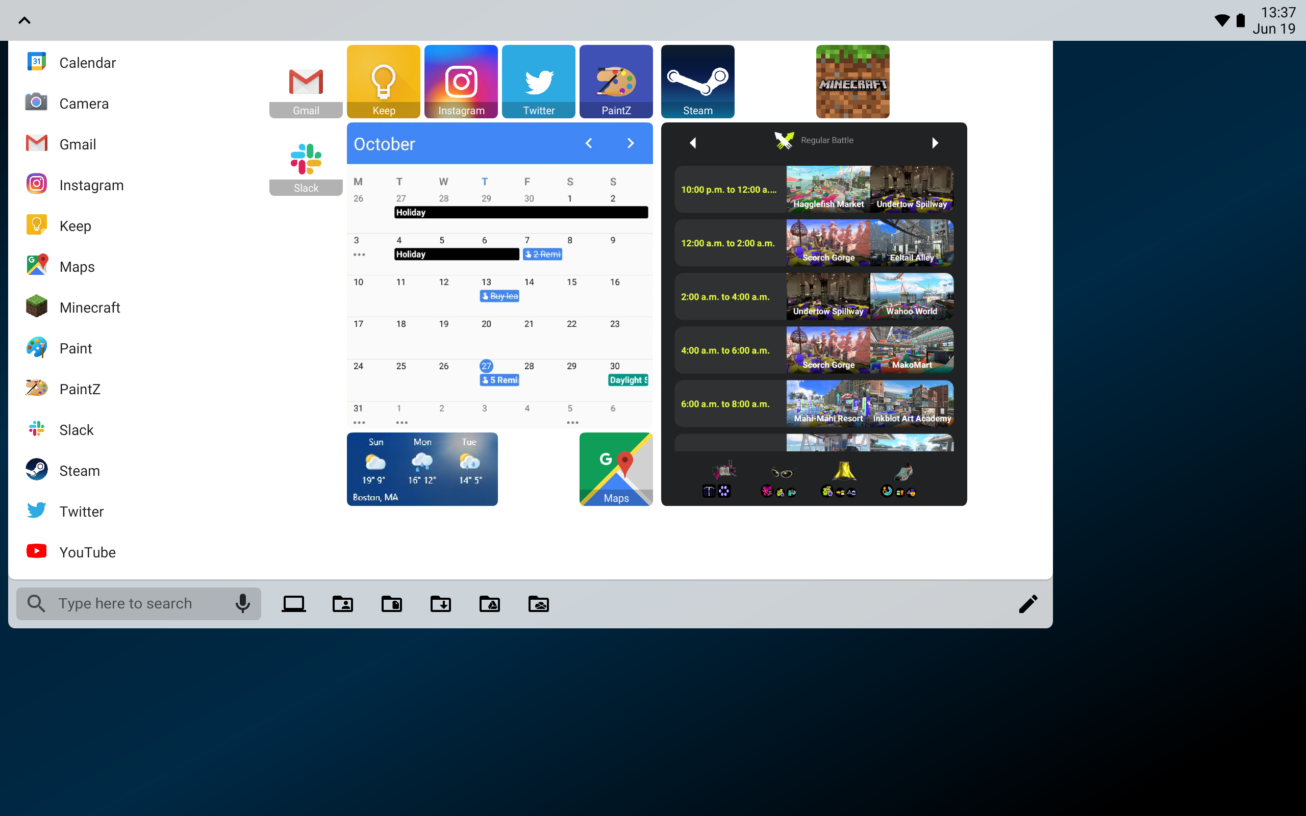
A consistent UX from mobile to tablet to desktop is a laudable goal, but on many platforms, it feels as though the designers thought the only choices were to make the tablet experience more like a big smartphone or a traditional desktop. One of my goals with Ideal UX was to provide a more consistent experience across form factors and interaction methods.
That also means the same interface components and touch gestures come from the same parts of the screen across all form factors, with the system bar always at the top and window controls always at the bottom.
No “home screen”
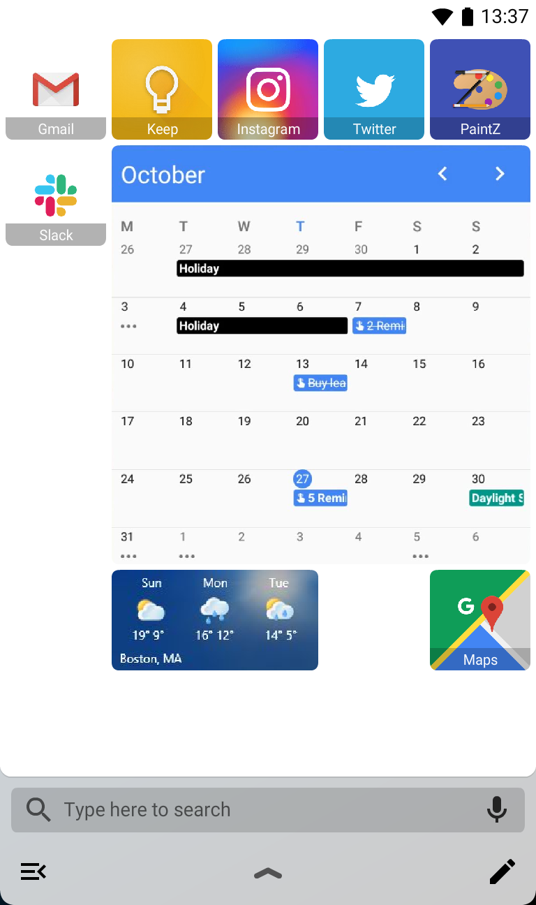
On most current mobile platforms, launching an app requires returning to a home screen, suspending the app you were using. Additionally, closing all apps returns you to the home screen. Ideal UX takes an approach more akin to desktop conventions, where the launcher is something you open over top of the current activity, not in place of it. It remains a customizable space where you can arrange apps and widgets as you like, but it exists to be the launchpad for your next activity, not a place to spend time in.
In that same vein, closing all open apps returns you to your desktop, not the launcher. You can choose to open the launcher or notification panel and start another activity, but unlike a home screen of apps and widgets, it also provides you a moment to decide if you want to step away from your device for the moment.
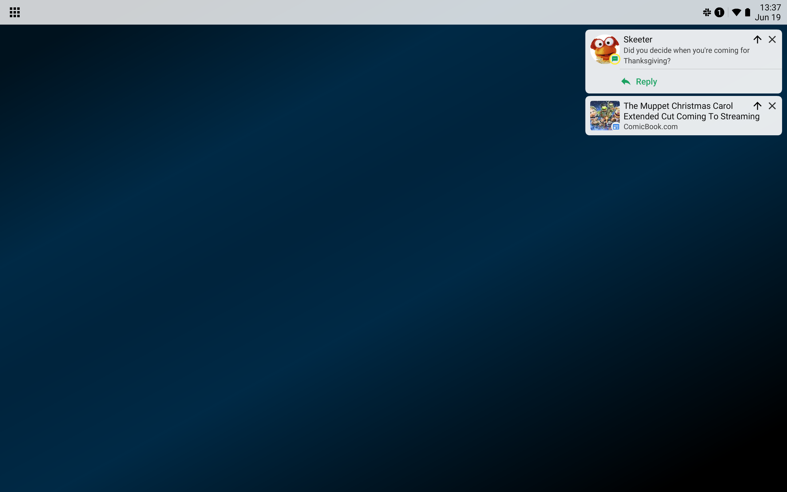
Focused notifications
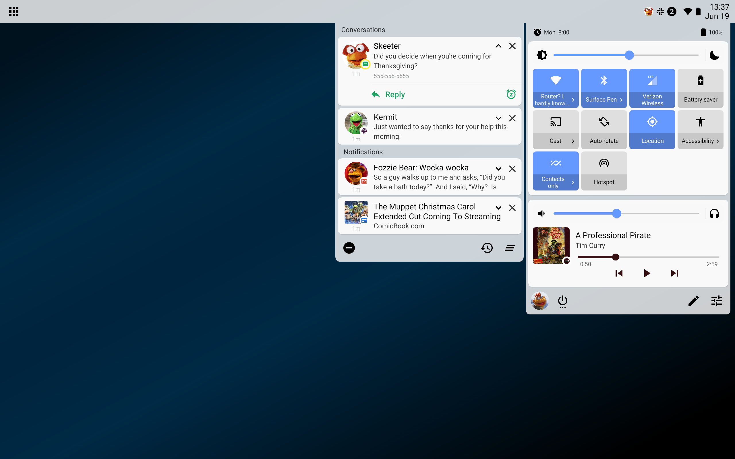
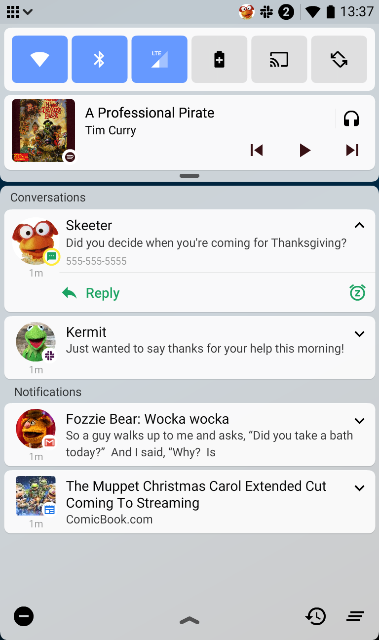
Past approaches of other platforms have ranged from one extreme of a cluttered notification bar that does little to separate high- and low priority notifications, to the other extreme of only showing the number of unread notifications, which also does not differentiate high- and low priority. At the most extreme, they give you no indication of unread notifications until you open the notification panel.
Ideal UX takes the refinements of Android 11 a step further. High priority conversations show the profile picture of the person contacting you, other conversations and higher priority notifications show the icons of the apps they are from, and lower priority notifications are grouped into the number unread. Snoozed notifications are removed from the count until they return, and when in do-not-disturb mode, no icons are shown at all.
Ongoing activites, such as calls, map navigation, and timers can expose small chips with additional information next to them (such as next turn direction or time remaining) which can pop up the associated notification when selected.